Imagine this: A customer finds your business online, clicks the link, and lands on your website. But instead of a smooth experience, they see jumbled text, cut-off images, and buttons too small to tap on their phone. Within seconds, they leave—and you’ve just lost a potential client.
That’s the power of responsive design. In today’s digital world, your website isn’t just being viewed on desktops—it’s being browsed on mobiles, tablets, and even smart TVs. If it doesn’t adapt to every screen size seamlessly, you risk losing customers before they even know what you offer.
What is Responsive Web Design?
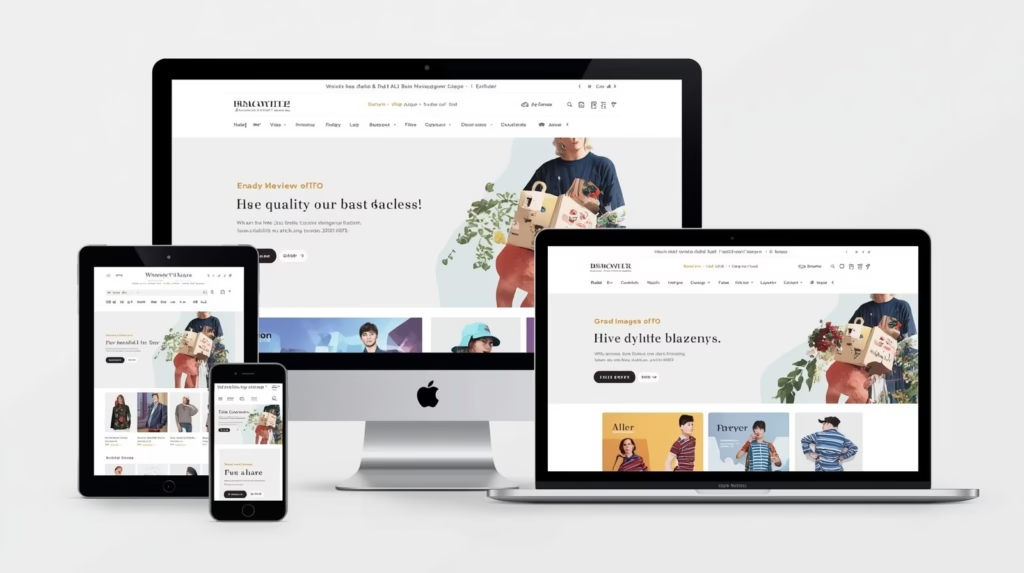
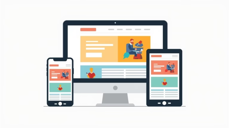
Responsive web design ensures your site automatically adjusts to fit any device—whether it’s a laptop, smartphone, or tablet. It’s not just about shrinking content; it’s about creating a smooth, intuitive experience across platforms.
Think of it as having a single website that behaves like many—flexible, user-friendly, and always looking its best.
Why Responsive Design is Non-Negotiable Today
1. Mobile is the New Desktop
Over 70% of web traffic now comes from smartphones. If your site isn’t mobile-friendly, you’re cutting off the majority of your audience.
A responsive site ensures no pinching, zooming, or frustration—just smooth browsing.
2. Boosts SEO Rankings
Google loves responsive websites. In fact, mobile-friendliness is a ranking factor. A non-responsive site won’t just frustrate users—it could also push you down in search results.
Responsive design = better SEO = more visibility.
3. Improves User Experience (UX)
Visitors expect a site that looks professional and is easy to navigate. If they can’t browse products, read content, or contact you easily, they’ll move on.
Good design isn’t just pretty—it’s functional, trustworthy, and conversion-driven.
4. Future-Proof Your Brand
With new devices and screen sizes launching every year, responsive design ensures your site keeps up without constant redesigns.
One design that adapts everywhere = long-term savings and consistent branding.
Key Elements of Great Responsive Design
To get responsive design right, you need more than just “shrink to fit.” Here are essentials:
- Flexible layouts: Content that resizes naturally.
- Scalable images: Pictures that adjust without losing clarity.
- Touch-friendly buttons: Easy clicks for mobile users.
- Fast loading speed: Optimized for all devices
Business Benefits You Can’t Ignore
Responsive design is not just about looks—it directly impacts your business growth.
- Higher engagement: Visitors stay longer when browsing is smooth.
- Better conversions: A streamlined checkout increases sales.
- Conversions: Smooth, error-free browsing increases sales/leads.
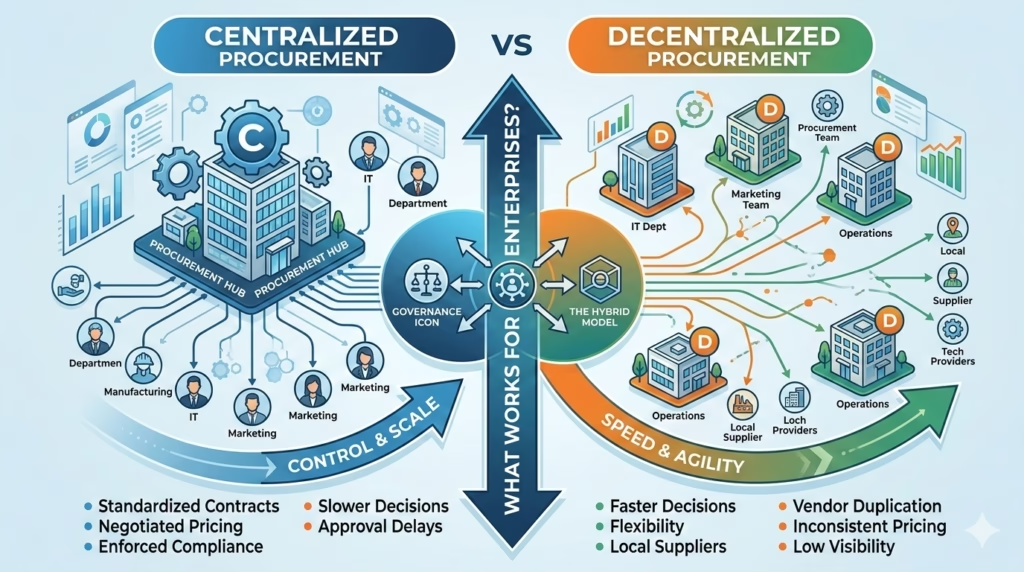
The SMACON Advantage
At SMACON, we don’t just design websites—we create digital experiences. Our responsive web design services ensure your brand looks flawless and performs seamlessly, no matter the device. From UI/UX optimization to performance-driven layouts, we help you deliver a website that works as hard as you do.
Final Word
In a multi-device world, your website has just one chance to impress. Don’t let poor design cost you customers. With responsive design, you can ensure your website always puts its best face forward—everywhere, every time..
Ready to make your website future-ready?
Talk to SMACON today and let’s build a site your customers will love.